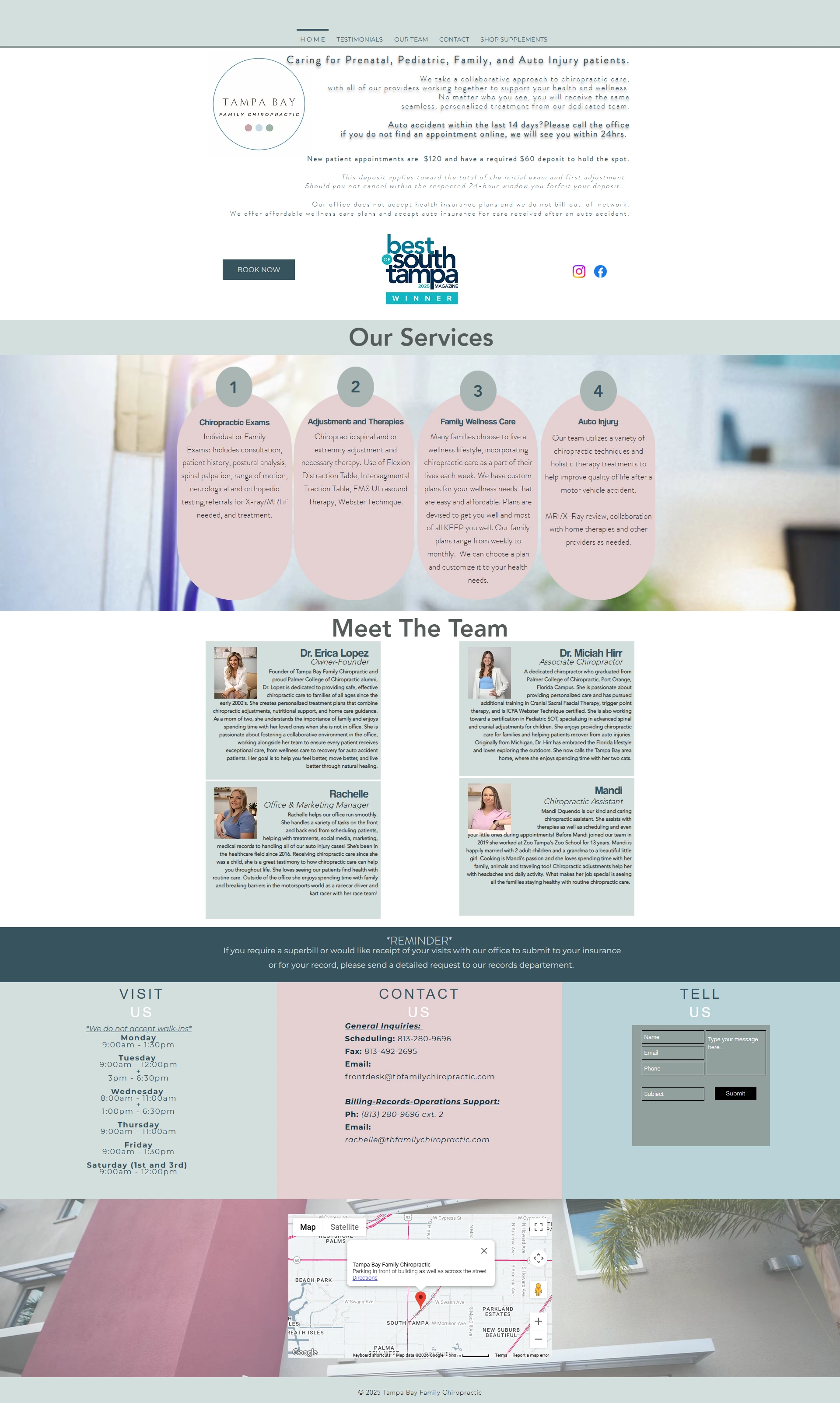
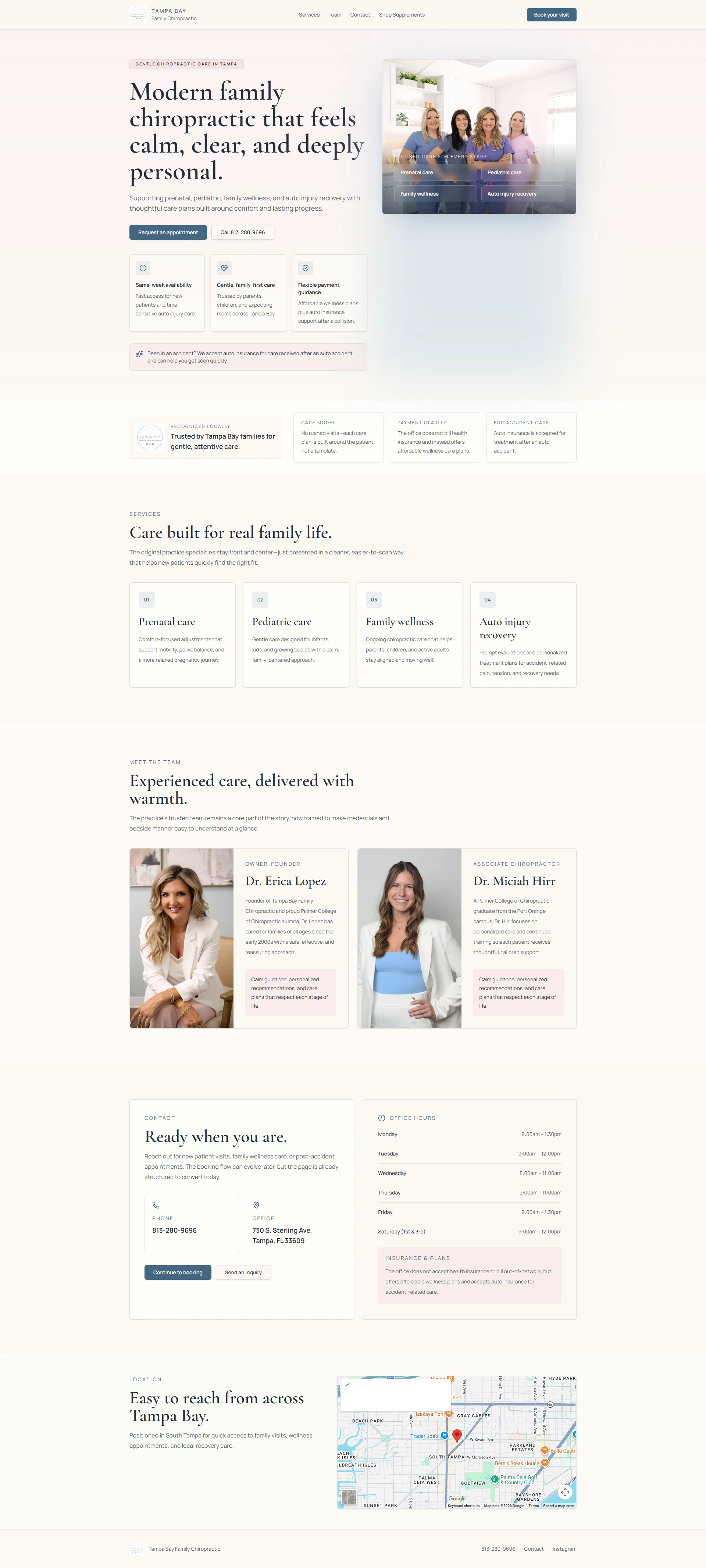
RELIANTAI Book a Call
⚠️ This is an unsolicited concept redesign — not a paid project. Built to show what's possible.

What a Modern Chiropractic Website Should Look Like

Tampa Bay Family Chiropractic had the right business — but the wrong website. We redesigned it to show how a modern, AI-built site can turn more visitors into booked appointments.

The difference a modern website makes

Before

Before — Tampa Bay Family Chiropractic old website Hover to scroll ↓

After

After — Tampa Bay Family Chiropractic redesigned website Hover to scroll ↓

Before

What was wrong — and what it was costing them

  • Outdated design that kills trust — Visitors judge a business in 3 seconds. An old, cluttered website tells them to look elsewhere — and they do.
  • Not mobile-friendly — Over 60% of people search on their phones. This site broke on mobile, meaning most visitors were getting a bad first impression.
  • No clear call-to-action — Visitors had no obvious next step. No easy way to book, call, or even understand what the clinic offered.
  • Looks nothing like the competition — Nearby clinics with modern websites were winning patients simply by looking more credible online.

A website this outdated doesn't just look bad — it actively turns away patients who would have booked.

After

What the redesign delivers

  • Clean, modern design that builds instant trust — Professional, calm, and on-brand. Visitors know immediately they're in the right place.
  • Fully mobile-responsive — Looks and works perfectly on every device — phone, tablet, or desktop.
  • Clear booking flow — A prominent "Book Your Visit" button above the fold. No confusion. No friction.
  • Positioned ahead of local competitors — A site that looks this good doesn't just attract patients — it keeps them from clicking away to a competitor.

A website this sharp works like a silent salesperson — 24/7, without you lifting a finger.

Three things that were hurting this business online

Outdated & unprofessional design

The old site looked like it was built over a decade ago. No structure, no hierarchy, and no visual identity beyond a logo. In a competitive local market, that's enough reason for a potential patient to close the tab and book with someone else.

A complete visual overhaul — modern layout, clean typography, professional imagery placement, and a design that reflects the quality of care the clinic actually provides.

No mobile version

The site wasn't built for phones. Text overlapped, buttons were too small to tap, and the layout broke completely on smaller screens. For a local service business where most searches happen on mobile, this was a serious problem.

A fully responsive design that adapts perfectly to any screen size — so every visitor gets the same great experience whether they're on a phone, tablet, or desktop.

Slow loading

A slow website doesn't just frustrate visitors — it gets penalised by Google. Slow sites rank lower in search results, which means fewer people even find the business in the first place.

A lean, optimized build from the ground up. Fast load times on every page — good for visitors and good for Google rankings.

AI-powered. Delivered fast.

We didn't spend weeks going back and forth. We used AI-powered design and development tools to move fast without cutting corners. The entire concept was designed, built, and optimized in a matter of days — not weeks.

This is how we work for every client. No bloated agency process. No unnecessary delays. Just a clean, modern, high-performing website — built with AI and delivered in 7 days.

7

Days

Concept to completion

AI-Powered

Tools & Process

Faster builds, better results

Fixed Price

No Surprises

Transparent from day one

Does your website look like the "Before"?

Book a free 20-minute call. We'll take a look at your current site, tell you exactly what's holding it back, and show you what a modern version could look like — no pressure, no pitch.

Book a Free Call →